We started working with Ryan from Velox Tennis on some print projects to advertise his new multi-sport services.
It became clear pretty early on that a rebrand was required to appeal and reach his new target audience.
He was no longer just promoting tennis coaching, competitions and camps, he was promoting a whole new program offering a range of sports.
We met with Ryan and discussed the new program, what it offered, who it was targeted towards and the beniftes and outcomes of the program.
From there we discussed the elements of the logo and the relationship that he still wanted to keep to the Velox Tennis branding.
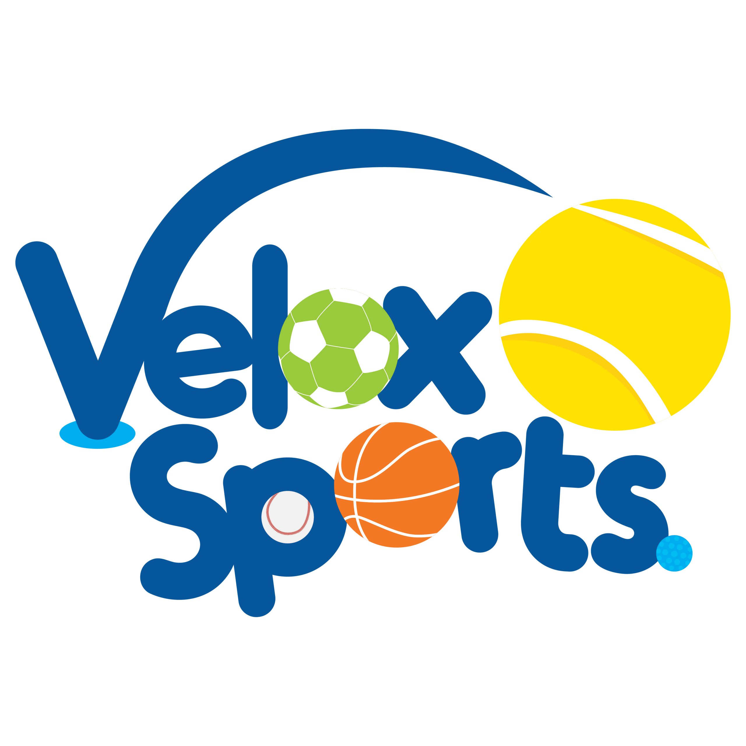
Ryan wanted to stay true to his brand colours of blue and yellow, rounded typography and the concept of the ball being bounced or kicked through the letter V in the logo.

From there we researched other multi-sport programs on offer in the area and even overseas. Velox Sports was going to be a major player in this market and we wanted to make sure we were developing a brand that would appeal to the young market and appear professional at the same time.
We wanted to keep the logo very illustrative and fun! We designed a range of different sporting balls to be used throughout the logo to immediately display the multi-sport services on offer. The new Velox Sports logo is very playful and visually striking but still has the visual connection to Velox Tennis and the professional services they are known for.
The client was extremely happy with the logo and we have since designed banners, stationary and social media ads using the new logo!

There is just the start for this amazing brand, stay tuned for more exciting developments!
Ready for us to create an amazing brand and online presence for your business?
Contact us and we will schedule a time to chat.
