Designing branding for an established company is quite challenging, but also really exciting!
Jentech Designs are industrial engravers and sign makers. They are a family run business located in Tarren Point with over 60 years industry experience. They service individuals, sign companies and architects with various custom projects.
We originally met with the team at Jentech Designs to discuss their new website. During this discussion we touched on their current branding, colours and company values and ambitions.
After discussing the exiting logo and colour pallet, they decided that it did not represent their brand in the way they wanted. The logo had been design a while ago and they did not love their logo anymore, they were not excited by their brand.
“At Daydream Creative we believe that you should be excited to show off your brand and it should reflect your business values.”
It was after discussing their brand that they decided to rebrand. They were very excited about this once they decided to take the leap! We asked them for any logo inspiration or typography they liked and researched their competitors and industry.
Designing for a traditional industry can be challenging. You want to come up with a modern and eyecatching design but you also want to stay true to the history of the industry.
After researching and taking into account the clients logo inspiration, we developed new branding for Jentech Designs.
We developed a variety of initial concepts for the client to review. These pushed the boundaries with colours and the incorporation of styalised graphics that would represent the company and the services they provide.
The client reviewed them all and decided to develop the chosen concept further.
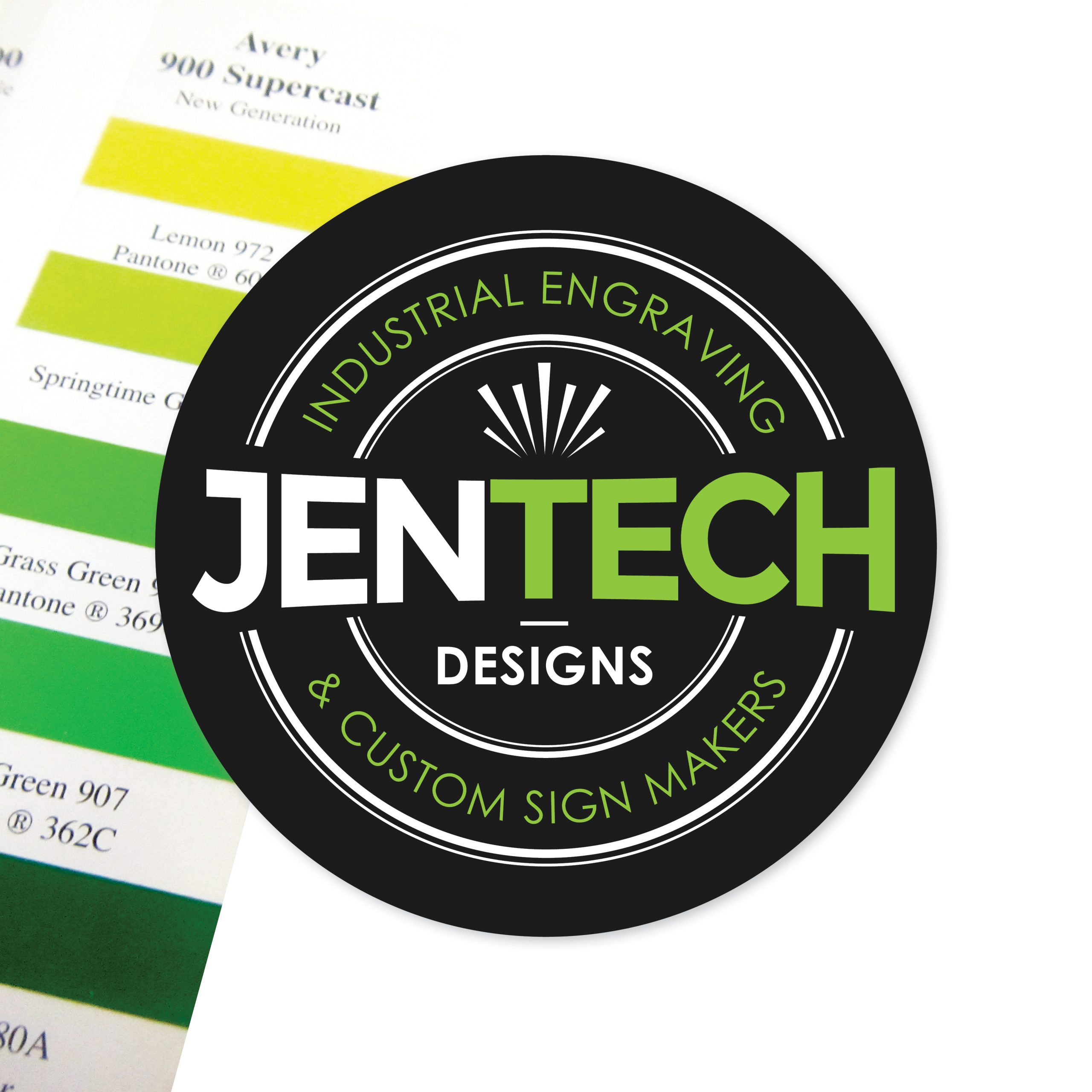
We used a modern font together with a traditional circle to create a modern logo that represented the brand values.
We also included the tagline ‘Industural Engraving & Custom Sign Makers’ within the logo space so it is ovious and explains clearly the services they provide.
We developed a simplified graphic to sit within the largely typographic logo to represent the lazer technology they commonly use.
We decided to incorporate a bright green with a dark charcoal as it really popped and made the traditional logo style more relevant and eyecatching!
The client was really happy with the result and is already planning on vehicle signage and creating a custom sign for their office.
Check out the custom website design we just launched – www.jentech.com.au.
Stay tuned for more on this awesome company!
Check out our more recent projects here…
