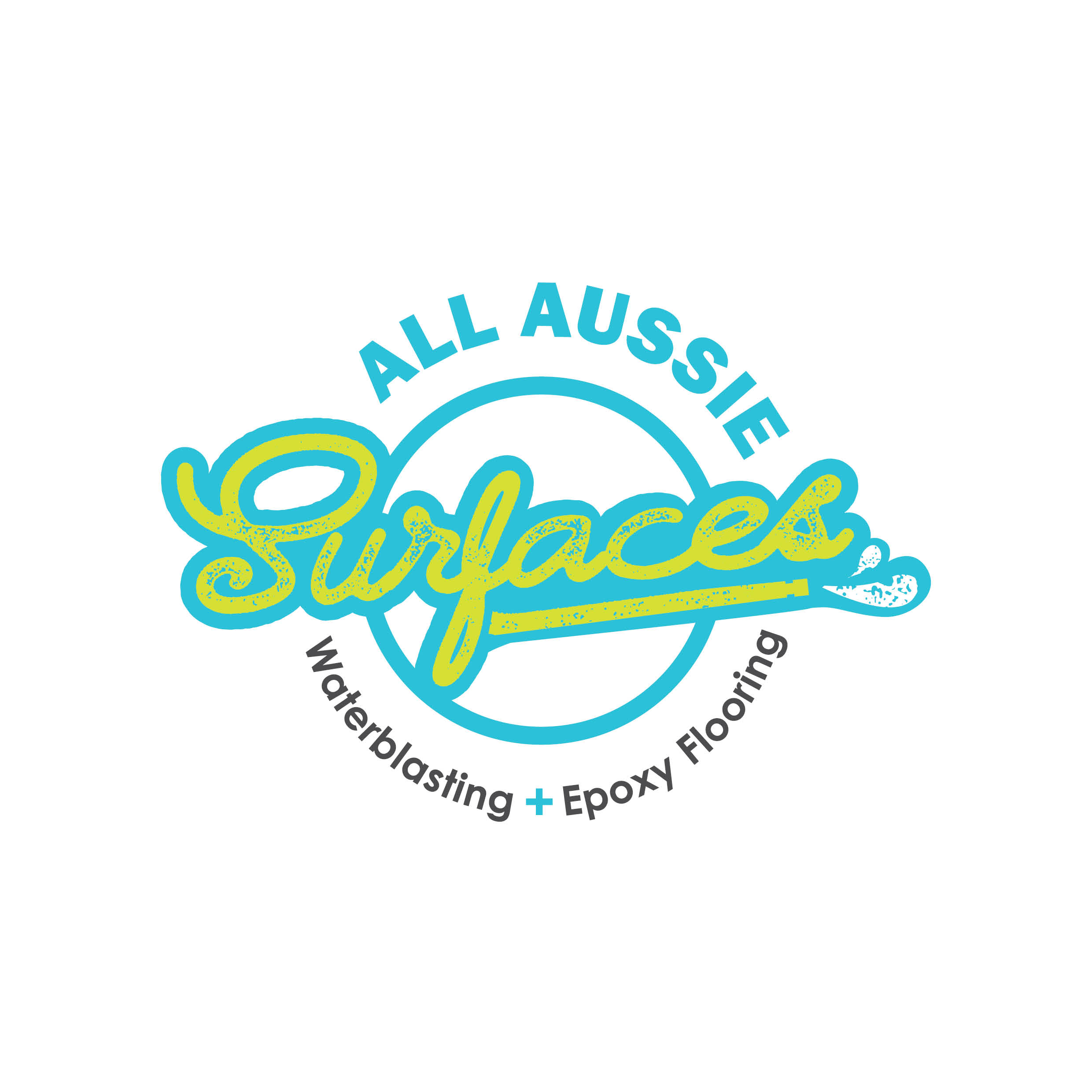
How striking and unique are these new brand colours for All Aussie Surfaces?!
We recently completed a rebrand for our client and the result is stunning.
We initially had a meeting with the business owner to discuss the business and the reason for the rebrand. We learned that the business had grown and new services were now being offered, and the original logo was now not a great representation of the business.
We brainstormed new business names with the owner until we locked in All Aussie Surfaces. We kept the ‘All Aussie’ part of the original name for brand familiarity but that is all that remained from the original brand.
The new logo is visual, eyecatching and represents the brand in a fun but professional way. The flow of the lettering and the twist on the original Aussie green and gold all comes together to create a strong brand. You will notice the subtle icon reference to waterblasting, adding to the overall relatability and strength of the brand. The services tag line really gives the overall logo balance and a polished look and feel.
We are now working on a custom designed website that will launch early 2021 – watch this space!
