Designing strong brands…
The brief from our client was quite simple – Create something that is eye-catching, unique and not too corporate. Chocolate Cactus are specialists in organisational change management for businesses.
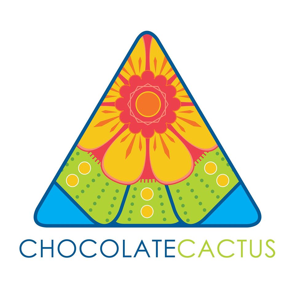
Our client supplied photographs of flowering cacti as inspiration for colour and form. We did research around different types and shapes of the different varieties of cacti. We illustrated a flowering cactus from top view to create an amazing combination of colours and shapes.
We decided to have the graphic within a triangle. Our client did not expect this at all. We explained that people don’t expect the words chocolate and cactus to be placed together, we wanted to play on that and continue the theme throughout the brand.
Our client was very happy with the end product. We developed a unique and instantly recognisable logo that represented their brand.


