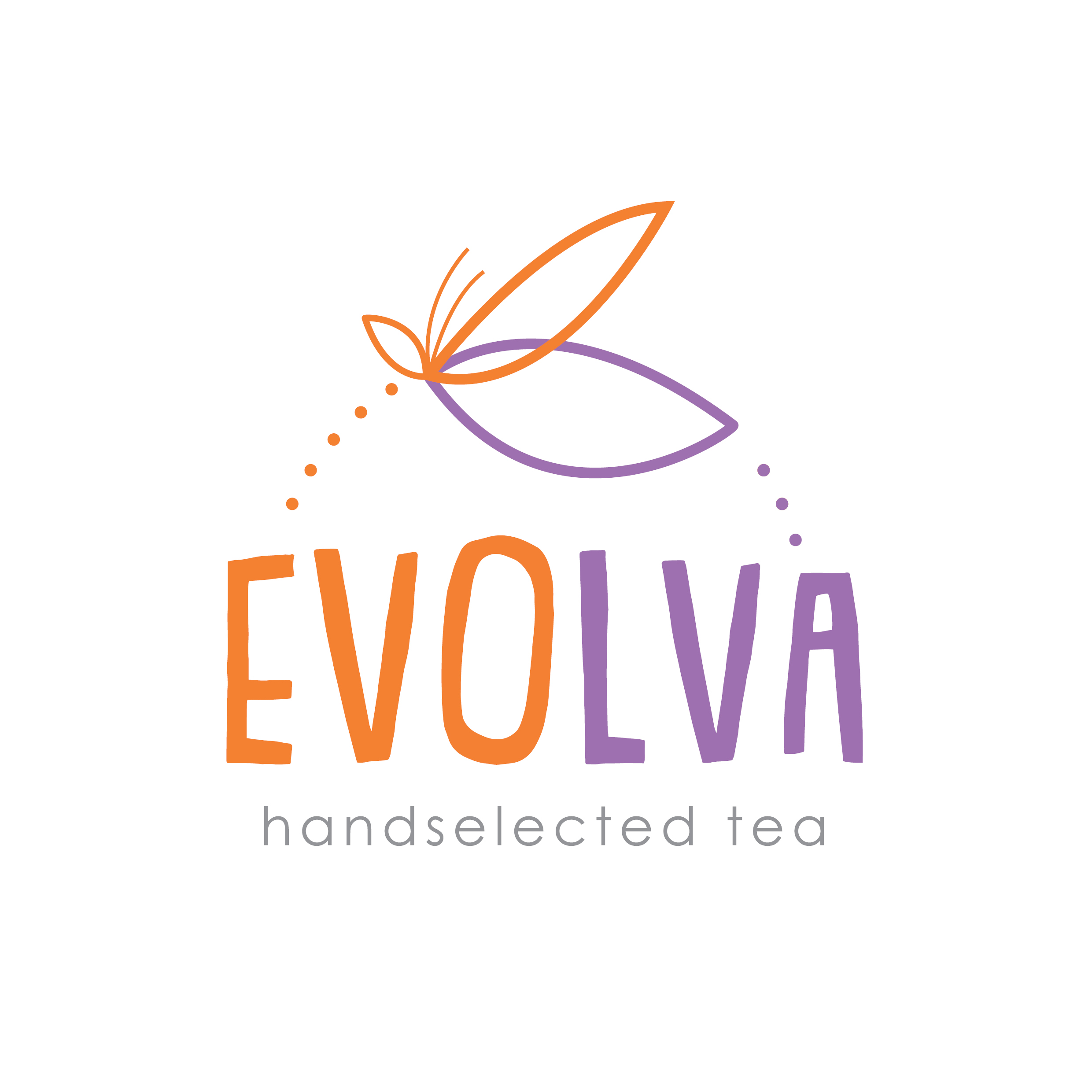
Loving the colour combinations and general composition and flow of this logo design we created for Sydney based brand Evolva.
This branding is for an Australian organic tea brand that is about to be launched onto the market.
We worked closely with the owner to develop branding that encapsulated his vision of the beauty of the moth cycle and growth through organic shapes and colours to create a strong brand that would hit his target audience.
We sketched the icon to create a real feeling of growth and movement and created the perfect perspective through the simplistic illustration. We worked on a few concepts that included full circles to create the feeling of the cycle and evolution of the moth but decides that through the use of only part of the circle, we could still successfully convey the same vision.
We love the typography selection and treatment of the letters at different heights, once again creating interest and the feeling of growth in an organic way.
We worked on a few colour palette options before deciding on the natural orange tone and soft purple. These colours work so well together and we have a vision for the brand that will use these colours effectively across stationary, packaging and online to grow the brand.
The Daydream creative team are obsessed with this branding design for Sydney based brand Evolva – watch this space for exciting things to come.
