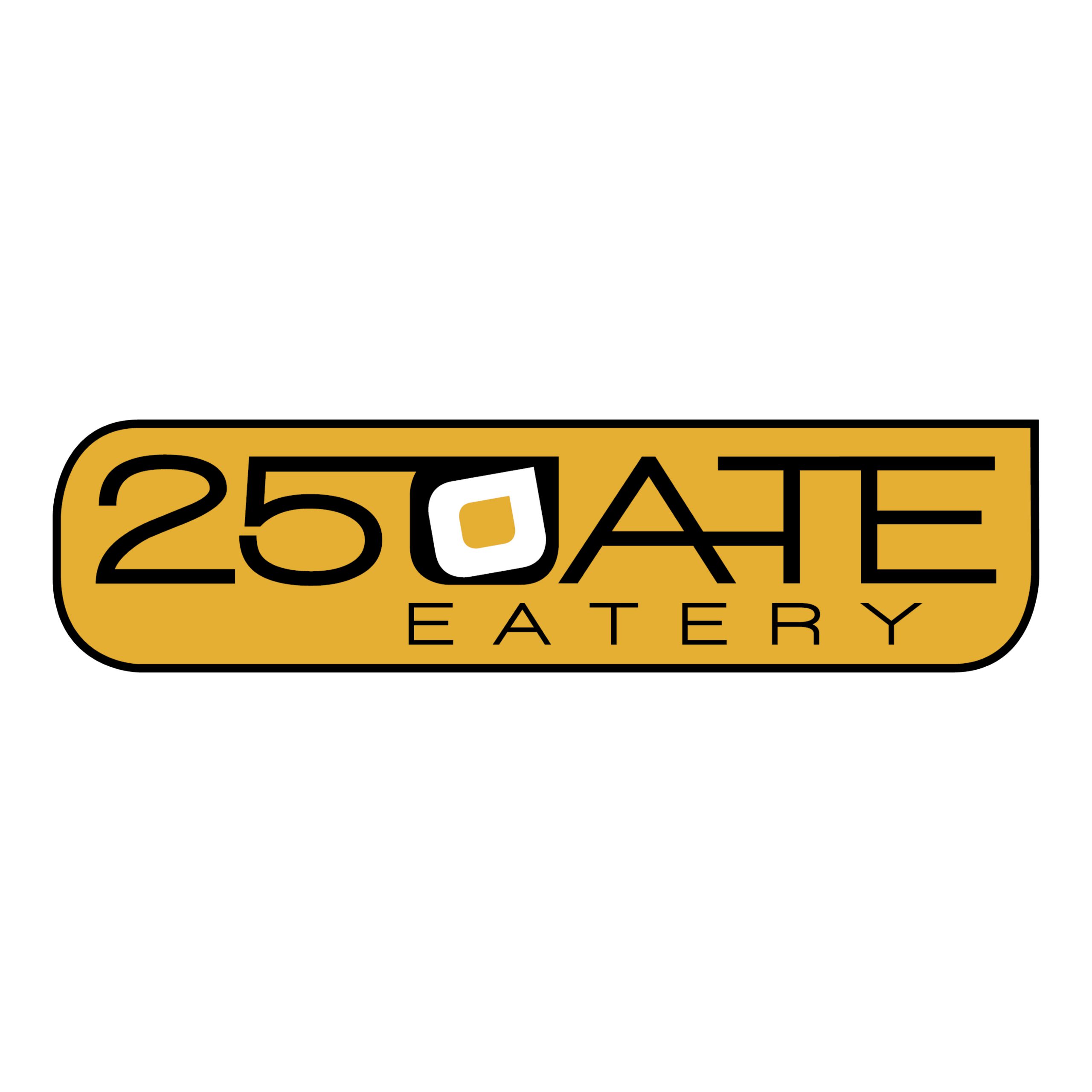
WE DESIGNED A MODERN LOGO FOR 250ATE EATERY.
The name is quite unique and quirky, drawing from the location postcode of 2508.
“The brief was to create a modern twist on a traditional diner logo. You will notice that the typography all links up, this is in reference to traditional neon signage. We also drew reference from numberplates, as in many traditional diners numberplates were featured inside the diner as decoration and part of the interior design. One last quirky and clever element was the ‘0’ in the logo, we had some fun here by creating an abstract version of a fried egg!”
We had a fantastic time working on the branding and signage for this project.
We actually also commissioned a graffiti artist to paint a mural within the café to compliment the amazing brand we had created!
The owner was thrilled with the results!
